If you’re new to Shopify, signup for an account here.
Accent Documentation
Getting started
Installation
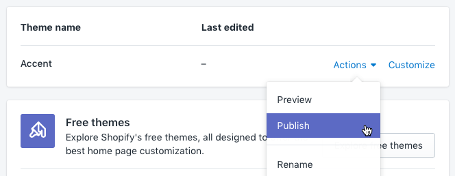
Log in to your Shopify admin panel and navigate to the Themes section. Then select the Upload theme option and upload a copy of the Accent zip file. Once the theme has uploaded, you have the options to Customize, Preview and Publish.
Language editor
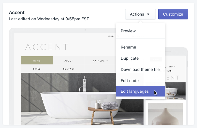
You can review and update any language in your theme, whether you created the translation yourself or it came with the download. View the official Shopify documentation here.
Theme customizer
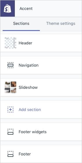
To edit the theme settings, select the Customize button, as shown above. When the page loads you will see a sidebar on the left, with all the theme options.
THEME STYLES
At the bottom of the Theme settings tab, is an option to "Change theme style".This is where you can load any styles that came with the theme. More information: Using theme styles
Sections
The first tab in the Customizer is called Sections. Here you can find settings for editing the Header, Navigation, Footer widgets and Footer sections.
Header
LOGO
In the Header section you will find options for uploading your logo. For the best results, use a PNG file with a transparent background.
You have the ability to upload both a light and dark version of your logo. The dark version (if uploaded) will be used by default for printing. The light version is only useful, if your page has a dark background. Once you’ve upload your logo, be sure to specify which logo (light or dark), to use in the main header.
You'll also find additional options, in the Header section, to control the padding and horizontal alignment.

ACCOUNT LINKS
The Header section also allows you to control the display of Account links that appear at the top of the page. This includes the Account links, Cart icon and the Search icon.
TOP BAR
At the very bottom of the Header section, you will see an option for add the Top bar. The top bar is a full width banner, which appears above the main header, when activated. It can be used to promote special offers and discounts.
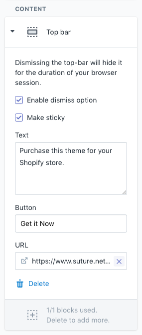
Closing the banner will hide it for the duration of your current browser session. If you close the banner and need to see it again (for preview purposes), relaunch your browser.
Navigation
In the Navigation section you can assign the Main menu. There is also a Style option for changing the design and alignment. Additional menu settings can be found in the Colors and Typography tabs under Theme settings.
See also: Create a drop down menu
See also: Create a drop down menu
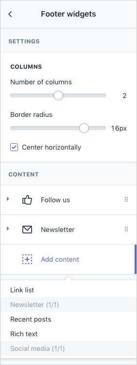
Footer widgets
This section gives you the ability to control the number of columns and placement of elements in the footer widget area. You can add up to three columns, with multiple widgets in each column. The widgets include: Link list, Newsletter, Recent posts, Rich text and Social media icons.
Footer
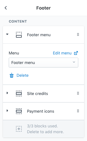
This section contains three content blocks: Footer menu, Site credits and Payment icons. These blocks are positioned at the very bottom of the page. You can drag the blocks to rearrange the order or delete a block to remove it from the page.
Footer menu
The section allows you to assign a secondary menu at the bottom of the page. Learn more about Navigation.
Site credits
The footer credits that appear at the bottom of each page can be managed in this section. This includes the copyright statement, design credit and currency notice.
Payment icons
The payment icon section has two modes. Automatic mode is based on actual payment services that are activated in your Shopify account. This mode uses the default Shopify payment icons. Manual mode allows you to manually select a range of payment icons. This mode uses a custom set of icons.
Theme settings
Background
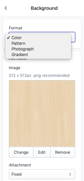
Under the Background tab, you'll find a number of options to set a custom background. First select the format that you wish to use, then customise the settings for that format.
Colors
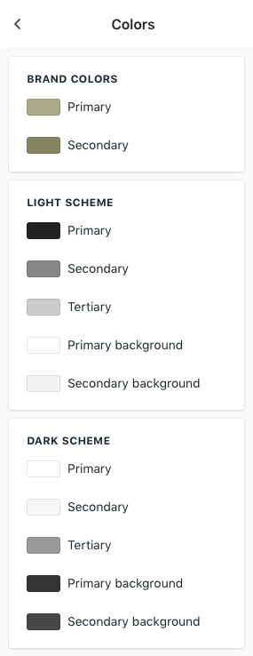
Enter your brand colours, the tweak then color schemes to suit your needs. Afterwards assign either the "Light" or "Dark" color scheme to the main sections of your theme.
Favicon
To set a Favicon, upload a 180 x 180px PNG file. A series of smaller images, for different platforms, will be automatically generated. For the best results, use a PNG file with a transparent background.
Typography
Font settings can be managed in the Typography tab. This includes support for a range of popular Google Web Fonts and Adobe Typekit. If you have an Adobe Typekit account, you can enter a Kit ID and set the font family name.
Collection grid
Coming soon
Currency converter
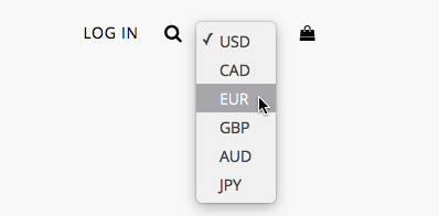
If enabled the Currency converter will appear at the top of the page with the Account links. The Currency converter allows customers to display prices in their preferred currency. It's important to note, that Shopify will still process orders in your shop's currency.
In order to function correctly, it is necessary to update money formats as outlined here: Help your script find money formats.
In order to function correctly, it is necessary to update money formats as outlined here: Help your script find money formats.
Checkout
The Checkout tab contains various display options for changing fonts, colors and logos on the Checkout pages. Additional options for managing Checkout can be found in the Shopify admin.
The images used in the theme demo have been purchased from various stock libraries.
Please note that these images are for demonstration purposes only, and are not included in the theme package.
Please note that these images are for demonstration purposes only, and are not included in the theme package.